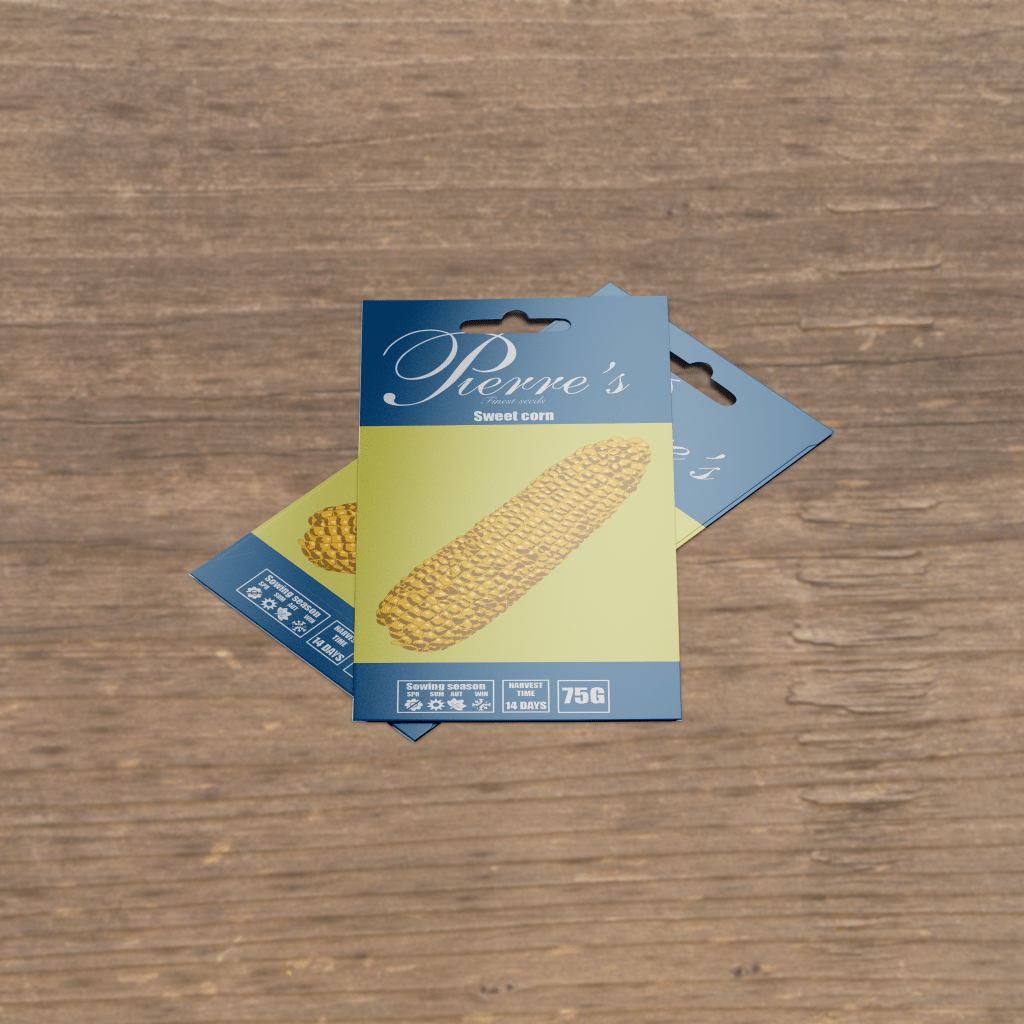
This packaging design project was created around the idea of ‘what if the popular farming game Stardew Valley was made into an animated tv show?’. In the game, the player character (PC) buys their seeds for their farm from Pierre’s General Store every season. Pierre, the shop owner often tells the PC that his seeds are the finest in the area, so it makes sense that this would be reflected on the seed packets themselves.
As the game and subsequent show is set in the late 90’s/early naughts (as evidenced by the presence of CRT computers, and landline phones throughout), the packaging had to reflect that through the use of colours and fonts. Sadly there is remarkably little seed packaging that can be definitely dated to the era. Snell Roundhand was used as the headline typeface and the kerning was modified to create an elegant wordmark. Impact was the secondary font on the front, as it was both historically accurate and contrasted nicely with the Snell.
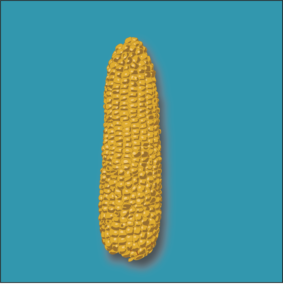
To keep with the animated feel of the show, and to stay somewhat true to the packaging in the game, a detailed image of a corn cob was created in Adobe Illustrator.
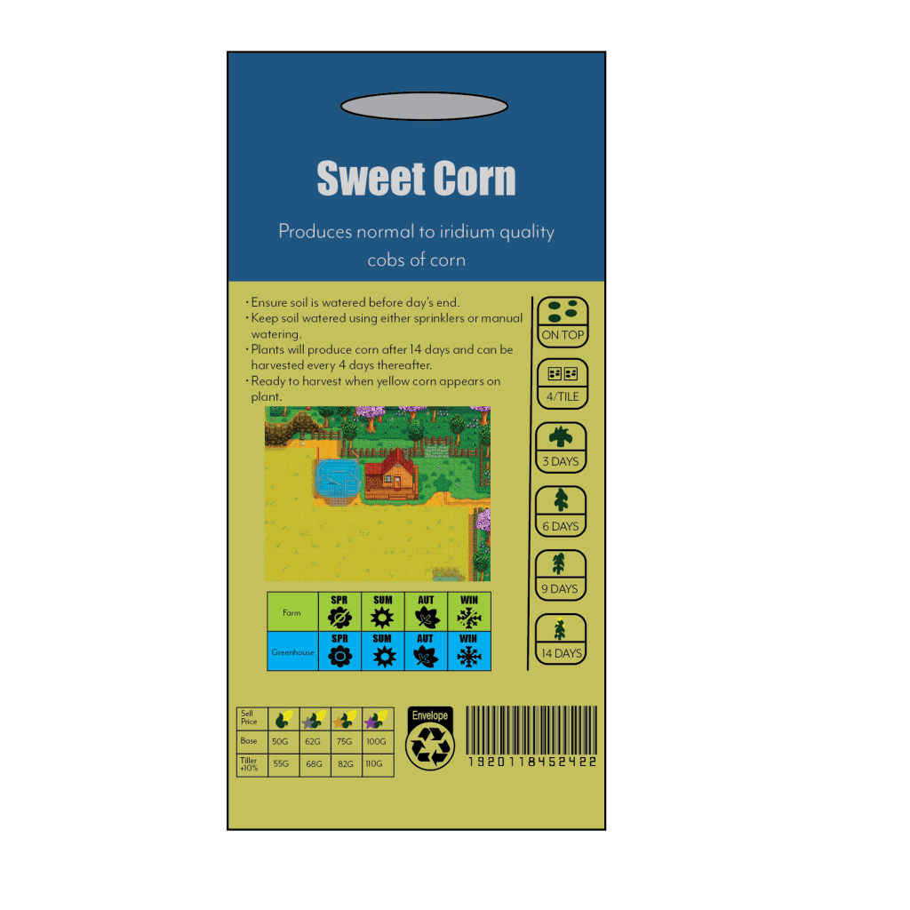
I wanted the back of the packet to be an in-game look copy of real seed packaging, so heavily referencing the Stardew Valley wiki, I used planting and selling information that would be very useful to a player, while also trying to remain a little bit vague, as players will often adopt their own planting style in accordance to a number of player controlled factors.