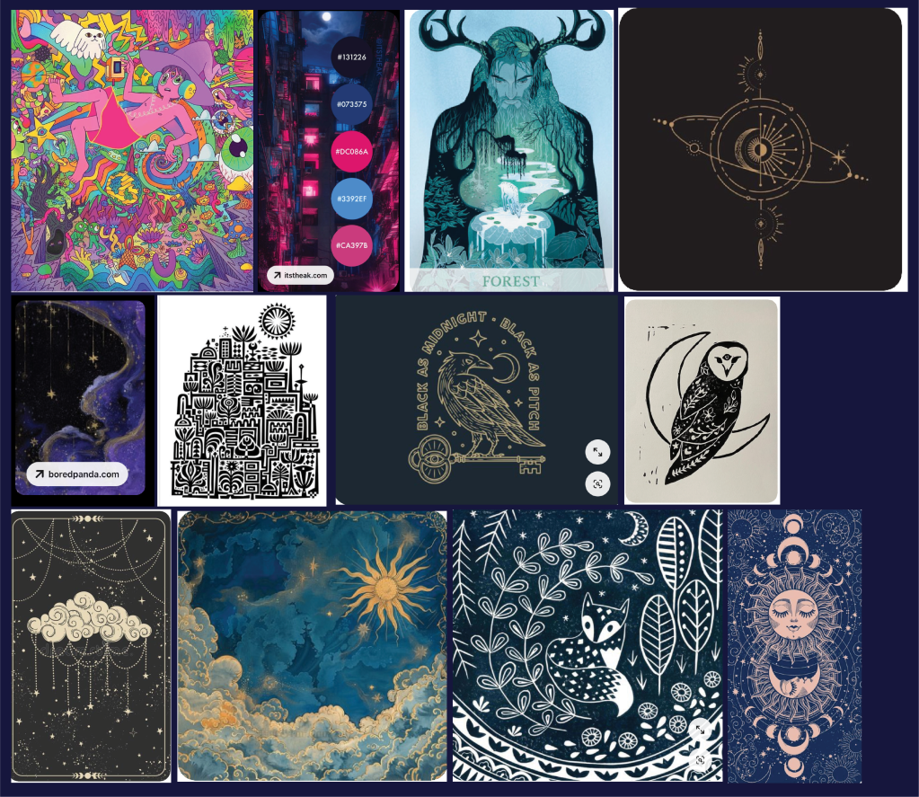
The brief for this project came from instagram account The Brief Diary, who post weekly briefs for their audience. The owners of this fictional coffee shop, Midnight Raven, wanted a primary logo, secondary logo and a brand mark, whose mystical aesthetic they wanted represented. After some research and ideation, my mood board and thumbnails looked like this:
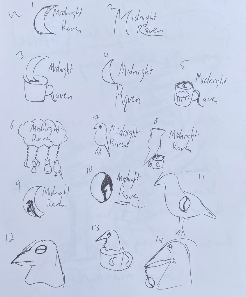
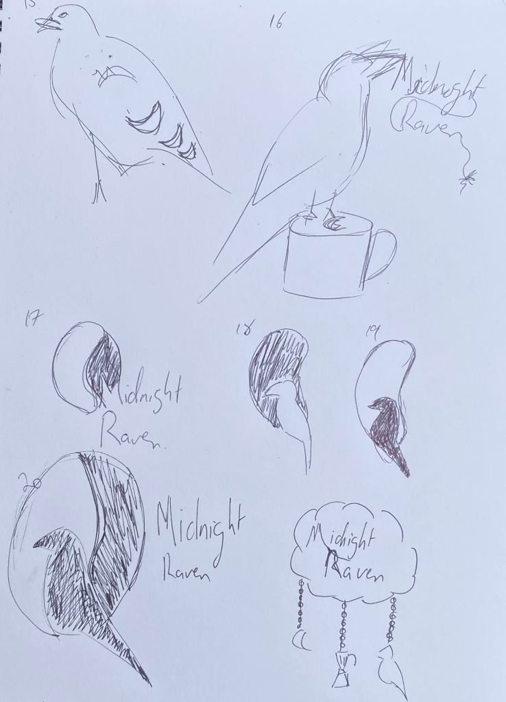
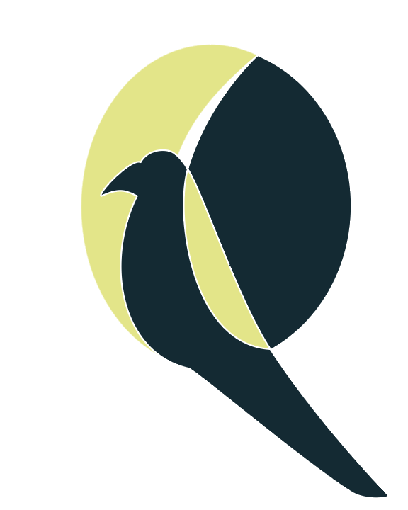
I liked the idea of playing with negative space, and somehow integrating a coffee bean; a moon; and a raven together, resulting in number 20 being the version that I chose to digitise.
Early versions of the icon were confusing and made it look like the raven was in flight, whereas the final version is a more clean, simple, but still obvious integration of all three above concepts.
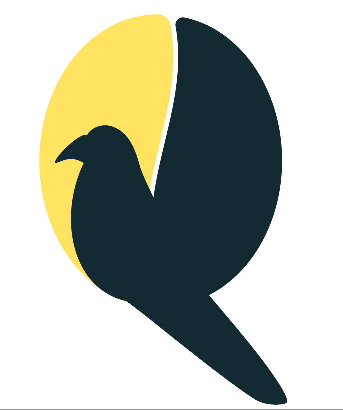

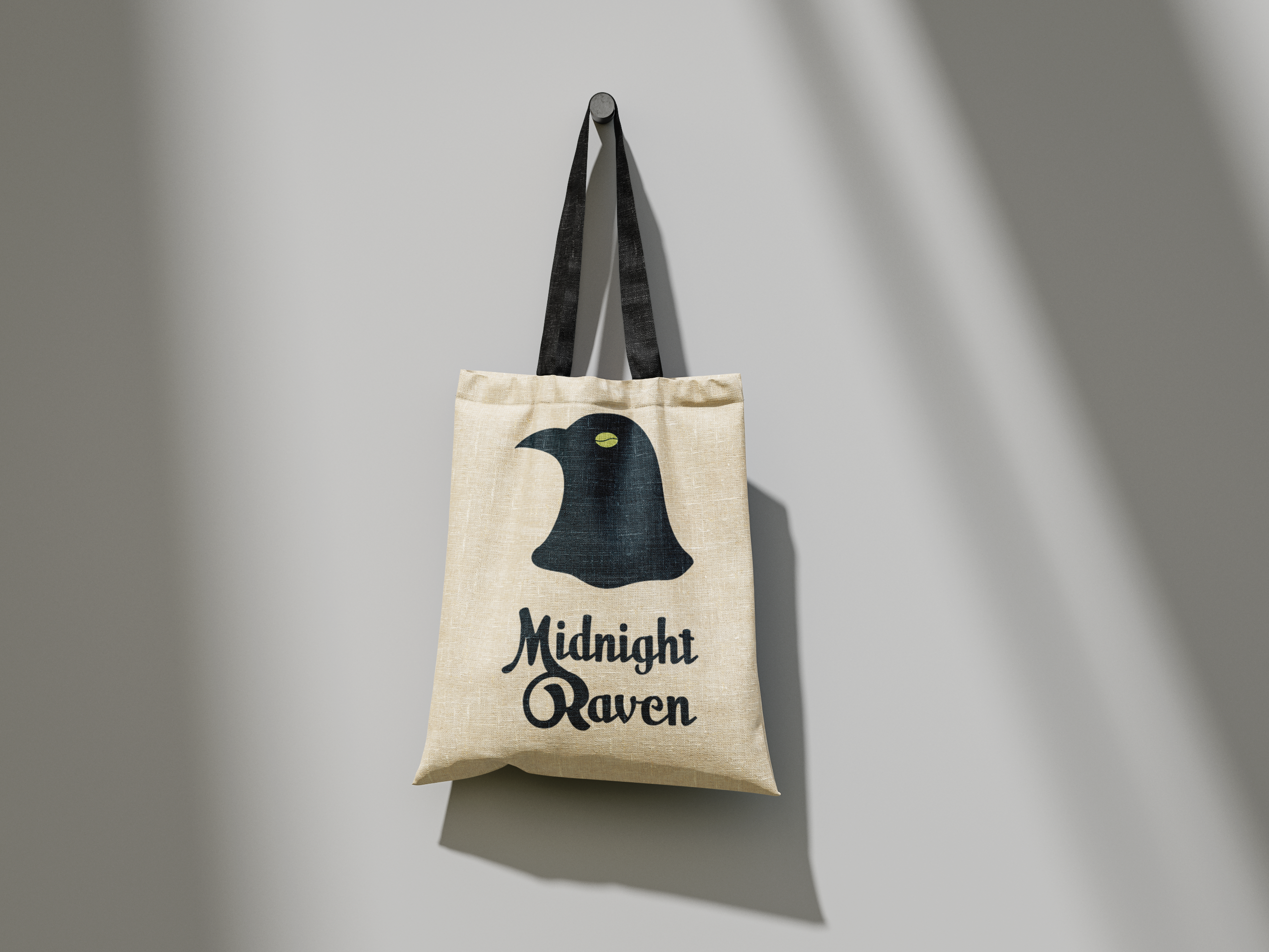
The wordmark is made from Milk Script that’s been modified to push up the baseline for the lowercase letters, and a monogram was made by joining the M and R in Midnight Raven. All work done to this point was done in Adobe Illustrator.
Final results
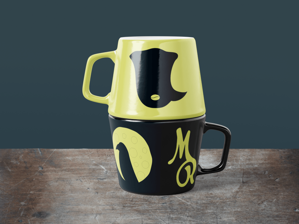
For the mockups, I chose to take some of my earlier rejected concepts and turn them into small illustrations to adorn a tote bag and some mugs. For a project that was created in under a week, I’m quite pleased with the end result! I think external or client feedback on the icon itself would be quite useful, as I think the coffee bean/ moon aspect could be tweaked a bit, but I’m not sure quite how. The delineation between the raven and the background is clear and obvious, while the two illustrations are fun, and play with negative space in their own small ways.