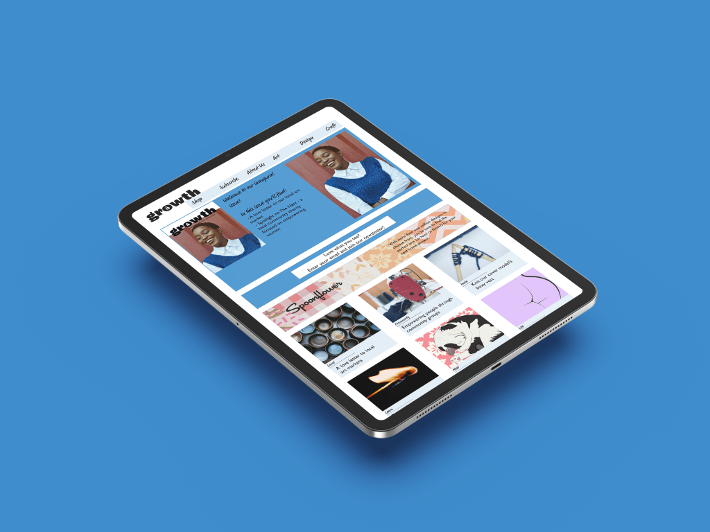
The focus of this assessment was on typographic layout and design. Were this magazine real, it would be seen on the shelves with Peppermint and Frankie magazines.
The brief only required a 12 page spread, with 2 ads and a web friendly equivalent which was created in Adobe XD. The masthead uses a heavily modified typeface Maple Black, and the photos were chosen to create the feel of a visit to a local arts fair. The name Growth was chosen for the fact that growth can happen as both a mindset and in a way that affects the world around the reader. Text was written by ChatGPT. I adapted the Spoonflower ad, so that it might tempt the reader into the possibilities that might be purchased from the store.


Leave a comment