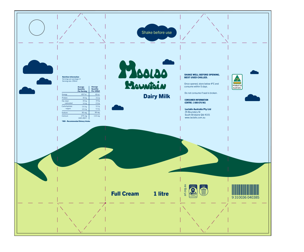
This assessment focused on creating packaging for an existing food or beverage product using typographical elements as a focus. I chose to highlight Mooloo Mountain milk, which is low cost milk sold in a nearby supermarket. They have no discernible online presence, and simple labelling. I redesigned this product to be sold as UHT milk, and utilised the bovine aspects of Mooloo Mountain’s name with a hand drawn word mark, and created a simplified view of Mooloo Mountain for visual interest. The focus was on accessibility and simplicity, in line with the existing product’s price point as compared to its competitors.


Leave a comment